
Challenge Visualiser & Explorer
Many European cities aim to set up collaborations with other cities based on open data and open source principles. But how can we reveal the common challenges amongst cities to set up this form of transnational co-development? This open source visualisation tool helps cities to discuss and find well suited common challenges with other cities. It is developed to enhance a smooth set up of these cooperative efforts.The challenge
A long term goal of SCORE, useful methods and tools are crucial to bring cities together around common needs and set up transnational co-development of software solutions. Therefore, all the participating cities assessed and collected their local urban challenges according to each of the SCORE themes. This generated an extensive collection of descriptions of urban challenges in the participating cities, which was then tagged and clustered to abstract the commonalities of these challenges.
However:
- We have experienced that the default format of such information, a long document, does not enhance collaboration much and can form a barrier. Long and static lists are not easy to make sense of. Endless challenge descriptions do not facilitate well the exploration of potential connections between cities in terms of challenges that they have in common.
-
Cities need to be able to reshare this information within their own administrations and colleagues who were not directly involved in the challenge discovery and capturing process. Extensive documents are not inviting and engaging tools to do this successfully.
The solution
We developed an open source visualiser which interprets the static data and transforms it into an explorable interactive visualisation.
Test the result for yourself on this link: https://lab9k.gent/score2/
Using interactive network graph renderings, this tool enables a visual exploration of how different cities relate to different challenges. This is done by simply composing an interactive overview of the connections (lines) between cities and (clusters of)challenges.
The challenge titles and the names of the clusters of challenges were formulated concise enough for the viewer to grasp their meaning quickly. Generic tags/keywords like 'mobility', 'parking', 'bike', etc. were added as they represent additional links between challenges. This further enriches gives more meaning to the visualisation.
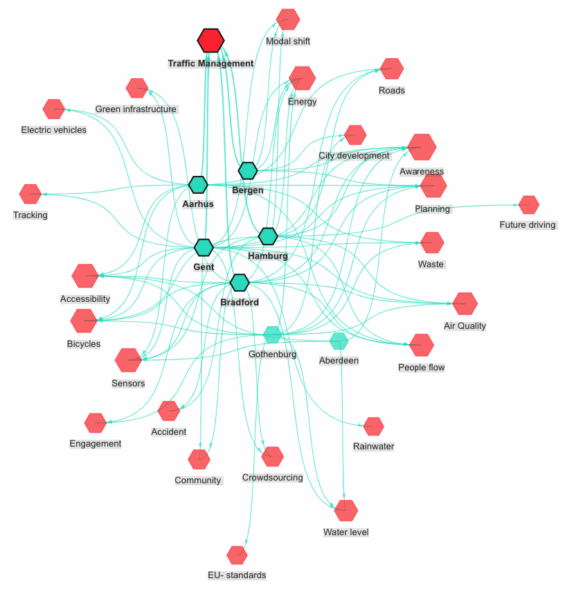
Figure 1 – main screen of the Visualiser
The tool
Implies and reveals relations, quantities and qualities not in a textual but in a visual way. It aims to assist in an intuitive way the exploration of collaboration potential. Common priorities and priority differences between cities are expressed graphically.
Avoids so called information overload effects of being presented a large dataset/list of challenges, typically a large volume of information that is hard to process by humans. It makes the challenges and the related metadata highly usable.
Thanks to the contextual links and the ability to navigate (and manipulate) the different types of nodes, the tool allows cities to:
Explore, discuss, identify and discuss the (possible hidden) common challenges that are behind their own context specific challenges.
Engage in new conversations amongst each other (and feed existing ones) about the mutual similarities and differences in terms of city priorities.
Confirm in a visual way their initial assumptions about which other cities to approach for which kind of collaborations.
Use the visualisations as proof and input for policy decisions in data-driven, evidence-based approaches.
…
It can form the focus point of discussions (and decisions) on transnational collaborations. It is deployable both for individual analysis and as conversation starter or facilitator for meetings/workshops.
Two screens
The current iteration reveals the information in two screens.
The main screen forms a general overview and maps the cities (in one colour) and the clusters of challenges (in an other colour). Clicking a node reveals the related nodes, eg. clicking a cluster node once reveals which cities are connected to that cluster.
(see figure 1)
The challenge screen is opened by double clicking one cluster of challenges (e.g. Traffic Management). All challenges that form this cluster are being mapped now, together with the cities that have put these challenges forward.
(see figure 2)
'Topic' nodes are also added. These keywords surround each challenge, and could help cities discover further common challenges beyond the challenges that are visualised.
Again, clicking a node reveals the related nodes, eg. clicking a single challenge reveals all connected cities.
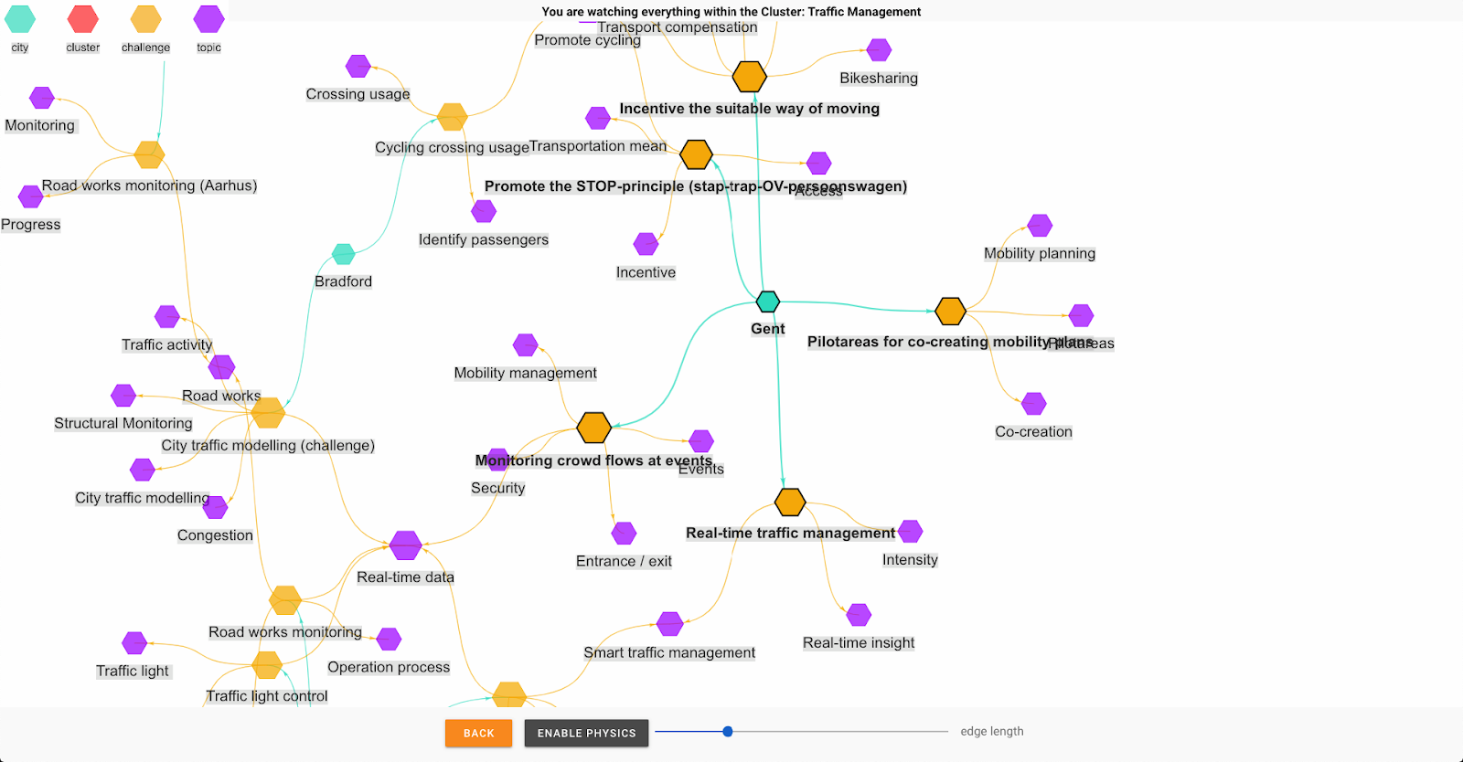
Figure 2 – 'challenge' screen of the Visualiser
Join us
For more information about this solution please contact these SCORE partners:
- District09 Ghent: Jef Willems, Jef.Willems@district09.gent and Tim Van Achte, tim.vanachte@district09.gent
- City of Ghent: Justine Ottevaere, [email protected]
The application's source code is available on Github, so its development can be followed closely and improvements can be suggested.
SCORE is a collaboration oriented, open source development project. You're most welcome to co-develop this application or follow its development more closely, if so don't hesitate to contribute to its Github repository.
